css

CSS conflict in React

CSS conflict in React

UI is the first step before we start typing logic to complete our front end. So we write the markup followed by the essential styles required to get the desired ui. While writing the markup we have to create meaningful class names to address and access the HTML tag and add style to it. With simple UI and distinct tags we can do so more or less easily. While writing repeating and complex UI, giving meaningful and distinct names becomes a disaster as there are only a few generic names. So we create components and style sheets for individual components.…
Read More
Building a Responsive Navigation Bar with Flexbox: Lessons from Wes Bos’ Course

Building a Responsive Navigation Bar with Flexbox: Lessons from Wes Bos’ Course

Flexbox is a powerful tool for creating responsive and flexible layouts. In this article, I'll walk you through the process of building a responsive navigation bar using Flexbox. This is from a lesson I've learned from Wes Bos' free Flexbox course, and this article is my way of internalizing and sharing what I've learned. Creating a Flexbox Navigation Bar In this example, I designed a simple navigation bar with multiple links, including social media icons, using Flexbox for layout control. The navigation bar is responsive and adapts to different screen sizes, thanks to Flexbox properties like display: flex, flex-wrap, and…
Read More
Understanding the CSS Box Model: content-box vs border-box, inline vs. block elements

Understanding the CSS Box Model: content-box vs border-box, inline vs. block elements

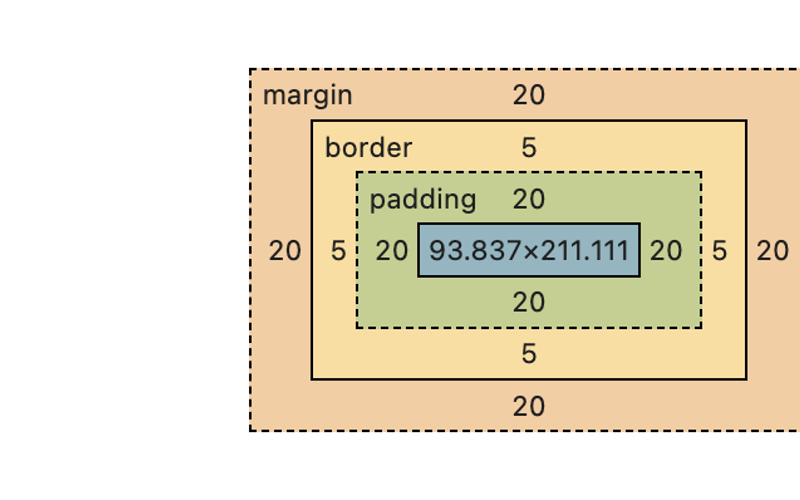
As a frontend developer, understanding the CSS box model is make-or-break for being able to deliver pixel-perfect layouts. Let's dive right in and discuss how both inline and block elements behave differently in the context of the two box model types—content-box and border-box. The Basics: What’s in the Box? Before we go into the details, it's worth it to recap what the box model even is. Every single element on your page is a box (yes, even the ones that don't actually seem boxy in shape). Boxes may be within, containing, and/or alongside other boxes. The box model applies to…
Read More
CSS Layout Techniques – Floats, Clears, and Legacy Layouts: The Old School Cool

CSS Layout Techniques – Floats, Clears, and Legacy Layouts: The Old School Cool

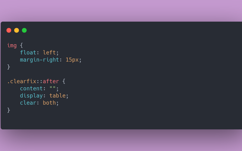
✨This article is part of a larger series that is available on my own website. Click here to know more about CSS 101: The Series. It's completely free! Welcome to a blast from the past! Before Flexbox and Grid swept in like the superheroes of modern web design, there was a time when floats and clears ruled the CSS universe. If you're a web design newbie, you might be wondering, "What on earth are floats and clears, and why should I care?" Well, buckle up, because we're about to take a nostalgic trip through CSS history. Spoiler: you might find…
Read More
HTML: o que é, Qual a sua importância para a web.

HTML: o que é, Qual a sua importância para a web.

Quando você entrar em sites de notícias, redes sociais, sistemas de bancos, entre outros, temos vários elementos que são disponibilizados na tela que possibilitam a interação do usuário. Mais você já parou para pensar em como tudo isto foi construído? Um dos profissionais responsáveis por construir um site é o desenvolvedor front-end, que transforma em código um layout feito pela equipe de UX/UI design utilizando o figma. Tecnicamente, a construção de um website é feita através de várias tecnologias, e uma delas é o HTML. Neste artigo, você vai conhecer o que é o HTML e para que ele serve…
Read More
Radio Asteral Frontend Design

Radio Asteral Frontend Design

This is a submission for Frontend Challenge v24.07.24, CSS Art: Recreation. Inspiration HTML Code `<!DOCTYPE html> Wave AnimationRadioAsteral <div class="circles"> <div class="circles_circle circle1"></div> <div class="circles_circle circle2"></div> <div class="circles_circle circle3"></div> <div class="gradint-color"> <div class="innercolor1"></div> <div class="innercolor2"></div> <div class="innercolor3"></div> </div> <div class="circleshadow"> <div class="gradint-color"> <div class="innercolor1"></div> <div class="innercolor2"></div> <div class="innercolor3"></div> </div> </div> </div> </main> <script src="https://dev.to/harish_05/script.js"></script> ` CSS Code `.menu {display: flex;position: fixed;left: 0;top: 0;width: 100vw;z-index: 10;background: black;height: 100px;opacity: 1;align-items: center;} .logoname h2 {font-family: Arial, Helvetica, sans-serif;color: rgb(255, 255, 255);opacity: 1;z-index: 11;font-size: 2.5rem;margin-left: 50px;margin-top: 30px;align-items: center;font-weight: 800;font-style: normal;letter-spacing: 0.2em;} .circles {border: none;background-color: #000;min-height: 100vh;left: 50%;overflow: hidden;position: absolute;top: 50%;transform: translateX(-50%) translateY(-50%);width: 100vw;z-index: 1;}…
Read More
Frontend Challenge August: Cricket League

Frontend Challenge August: Cricket League

This is a submission for Frontend Challenge v24.07.24, Glam Up My Markup: Recreation What I Built This project it will be used for the dev.to frontend challenge of August. I choose the second challenge: Cricket League!. I'm using the only Vanilla Javascript and CSS. I'm not using NPM/Yarn/PNPM as dependency package manager. This project is a simple project using vanilla javascript and using all the functions to replace and manipulate the DOM, just using javascript. All styles is a simple file of CSS. Also, is responsive, with accessibility, performance and Best SEO! Demo This project is hosted on Vercel. Just…
Read More
Creating a Smooth Transitioning Dialog Component in React: My Journey

Creating a Smooth Transitioning Dialog Component in React: My Journey

I've been working on a project to create a smooth transitioning dialog component in React, and I want to share my journey through the process, highlighting key steps and challenges encountered along the way. Part 1: Setting the Foundation In the first part of the series, I laid the groundwork by setting up the component structure. I created a context to manage the state and developed the main dialog component with its header, body, footer, and container. My primary goal was to ensure that the dialog could support minimisation and expansion while being adaptable to content changes. This foundation was…
Read More
Viewport height and width units in modern CSS

Viewport height and width units in modern CSS

As I keep encountering CSS codebases and theme definitions that solely use the traditional viewport units vh and vw, I thought about writing a blog post about the powerful tools we have on our disposal nowadays, that can make our lives easier and our CSS code better. The good old viewport units Long story short, for many years we've been using vh and vw to define something as percentage of the initial viewport height and width. For example, if we wanted to fill the entire viewport of all devices with green, we could do the following: .big-fat-green-element { background: green;…
Read More
Creating a Smooth Transitioning Dialog Component in React (Part 4/4)

Creating a Smooth Transitioning Dialog Component in React (Part 4/4)

Part 4: Final Refinements In Part 3, I enhanced the DialogAnimation component to calculate both expanded and minimised dimensions. This approach ensured accurate and visually appealing transitions by using successive render cycles to measure the dimensions. However, it introduced complexity and potential performance issues, particularly causing jank or flicker during the dimension calculation process. Introducing the Invisible Container To tackle the flickering issue, I'm introducing a secondary, invisible container exclusively for dimension calculations. This concept is inspired by techniques used in game development, such as double buffering, blitting, or offscreen rendering. These techniques help manage rendering by performing calculations offscreen…
Read More
No widgets found. Go to Widget page and add the widget in Offcanvas Sidebar Widget Area.