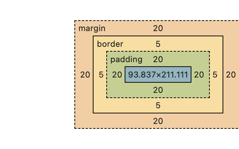
As a frontend developer, understanding the CSS box model is make-or-break for being able to deliver pixel-perfect layouts. Let’s dive right in and discuss how both inline and block elements behave differently in the context of the two box model types—content-box and border-box.
The Basics: What’s in the Box?
Before we go into the details, it’s worth it to recap what the box model even is. Every single element on your page is a box (yes, even the ones that don’t actually seem boxy in shape). Boxes may be within, containing, and/or alongside other boxes.
The box model applies to all of them and consists of:
- Content Box: An HTML element or CSS pseudo-element in which your actual content lives—text, images, what-have-you.
- Padding: The space between your content and the border.
- Border: The line wrapping around the padding and content.
- Margin: The space outside the border that pushes other elements away.
So nearly every HTML element within and including the <body>, and every CSS pseudo-element, is a box. The “walls” of that box are your border, and can be given a thickness (or width. Between the that content and the walls of that box you have padding. Between those walls and other boxes, you have margin.
Key Differences Between Inline and Block Elements
It’s crucial to understand the key differences in how the box model impacts inline versus block elements:
-
Width: Block elements expand to fill their container by default. Inline elements? They take up just enough space for their content.
-
Height: For block elements, padding, border, and margin will all increase the height. Inline elements stay within the line height, regardless of vertical padding or borders.
-
Layout Impact: Block elements influence both horizontal and vertical layout. Inline elements are all about horizontal flow, with minimal impact on vertical spacing.
-
Margin Collapsing: Margin collapsing is a behavior specific to block elements, where adjacent vertical margins can merge (so a
margin-bottom:20pxon one element can collapse into amargin-top:20pxon a following element, creating one20pxmargin). Inline elements don’t play this game.
Now that we know the components of the box model and the difference between inline and block elements, let’s see how content boxes are affected by the box-sizing property according to whether they’re an inline or block element.
Box-Sizing: content-box vs. border-box
The box-sizing property controls how the width and height of an element are calculated, and it can significantly impact the layout.
1. content-box with Inline Elements
When box-sizing: content-box is applied to an inline element:
- Width and Height: The width is determined solely by the content. Padding, border, and margin are added on top of this width.
- Layout Impact: Since inline elements don’t break the flow of text, the element’s width is only as wide as the content. Vertical padding and borders are visually present but don’t affect the height of the surrounding line.
2. content-box with Block Elements
When box-sizing: content-box is applied to a block element:
- Width and Height: The specified width or height applies only to the content area. Padding and border are added outside of this, increasing the overall size of the element.
- Layout Impact: Block elements expand to the full width of their container by default unless otherwise specified. Padding and borders increase the element’s size, pushing adjacent elements further away.
3. border-box with Inline Elements
When box-sizing: border-box is applied to an inline element:
- Width and Height: The width includes the content, padding, and border. The content area shrinks to accommodate padding and borders within the specified width.
- Layout Impact: The element’s width is still determined by the content, but now padding and borders are included within this width. Vertical padding and borders remain visually present but don’t alter the line height.
4. border-box with Block Elements
When box-sizing: border-box is applied to a block element:
- Width and Height: The specified width and height include the content, padding, and border. This means the element’s total size stays consistent with the specified dimensions, no matter how much padding or border you add.
- Layout Impact: The block element’s size is more predictable because padding and border are contained within the specified width. This makes layout design easier to manage, especially when aligning elements side by side.
It’s worth calling out that while content-box is the default, border-box is widely considered to be more intuitive and provide the greatest degree of control.
The CSS box model isn’t just a powerful concept—it’s a foundational tool in your frontend dev arsenal. By understanding how box-sizing affects inline and block elements differently, you can begin to create flawless layouts that are both sharp and functional without the annoyance of troubleshooting misbehaving layouts.
If you enjoyed this download on the Box Model, then hover over that heart-shaped box at the top-left and show this post all the love!
Source link
lol

