Introduction
Databricks AI/BI Dashboards have made significant strides since we announced their General Availability. Built on Databricks SQL and powered by Data Intelligence, AI/BI Dashboards offer a straightforward and seamless way to generate insights from your enterprise data in Databricks through highly interactive data visualizations, dashboards and reports. By consolidating data and analytics onto one unified platform, AI/BI streamlines business intelligence and democratizes data-driven decision-making across your entire organization.
The adoption of the product has been truly remarkable, with over 3K customers and 30K users relying on AI/BI Dashboards every week. If you’re a Databricks SQL customer and you’re not using AI/BI, you’re missing out. The product is included, and no additional licensing is required, so you can start using it today. Customers benefit from a modern AI-first BI solution located right next to your data, so you don’t need to worry about duplicating data, users and security policies in multiple systems or partial views of lineage from your data to dashboards and back. Additionally, AI/BI Dashboards are tightly integrated with Databricks Assistant, enabling developers to quickly create analytical datasets, queries, and data visualizations using natural language. Every Dashboard also comes with an AI/BI Genie, allowing non-technical users to ask follow-up questions and generate insights from their data through a GenAI-powered conversational interface.
Today, we’re excited to introduce a series of new features that take AI/BI Dashboards to the next level. Let’s dive in!
What’s New?
Multi-Page Reports
The introduction of multi-page reports marks a critical step toward richer reporting within AI/BI Dashboards. With multi-page support, users can now break down complex analyses across multiple pages, creating a cohesive story that flows from one view to the next. This structure makes it easier to navigate large sets of insights without overwhelming the viewer on a single dashboard.
Beyond organization, multi-page reports also optimize performance by only refreshing the data displayed on the current page. This focused processing reduces loading times, offering a more responsive experience as users explore their dashboards.
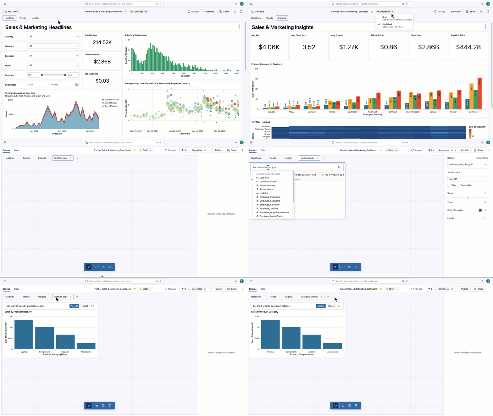
To create a new page in your Dashboard, just click the + button in draft mode, add your desired visualizations, name the new page and publish the results.
Integrated Dashboard Genie
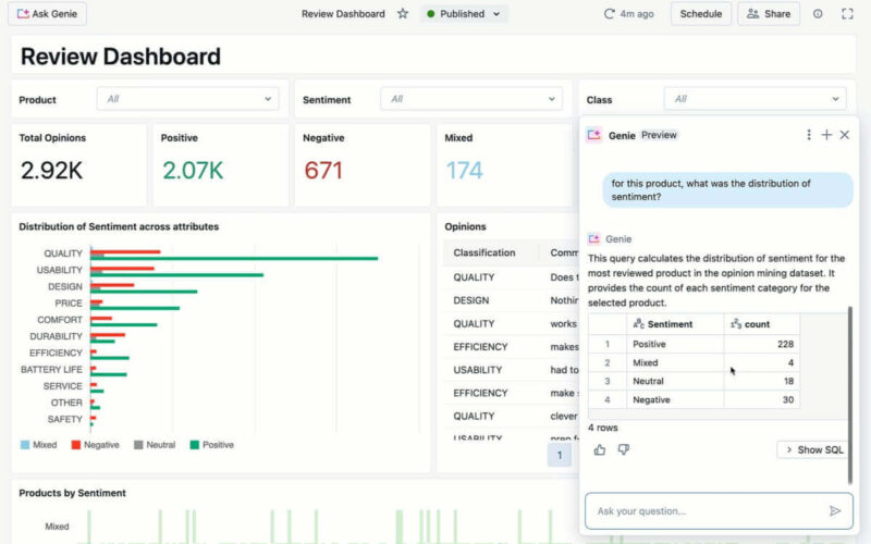
When viewing a dashboard, users typically have additional follow-up questions that surface in the moment – for example, maybe you want to see sales by region for a particular product line or calculate profit margin based on a sales and cost line item. With the new Dashboard Genie, viewers can now ask follow-up questions directly from the AI/BI Dashboard. This feature removes the need for another SQL query to be written or request a new dashboard visualization from the data team – just type in what you’re looking for, and Genie will respond based on the data already contained within the dashboard.
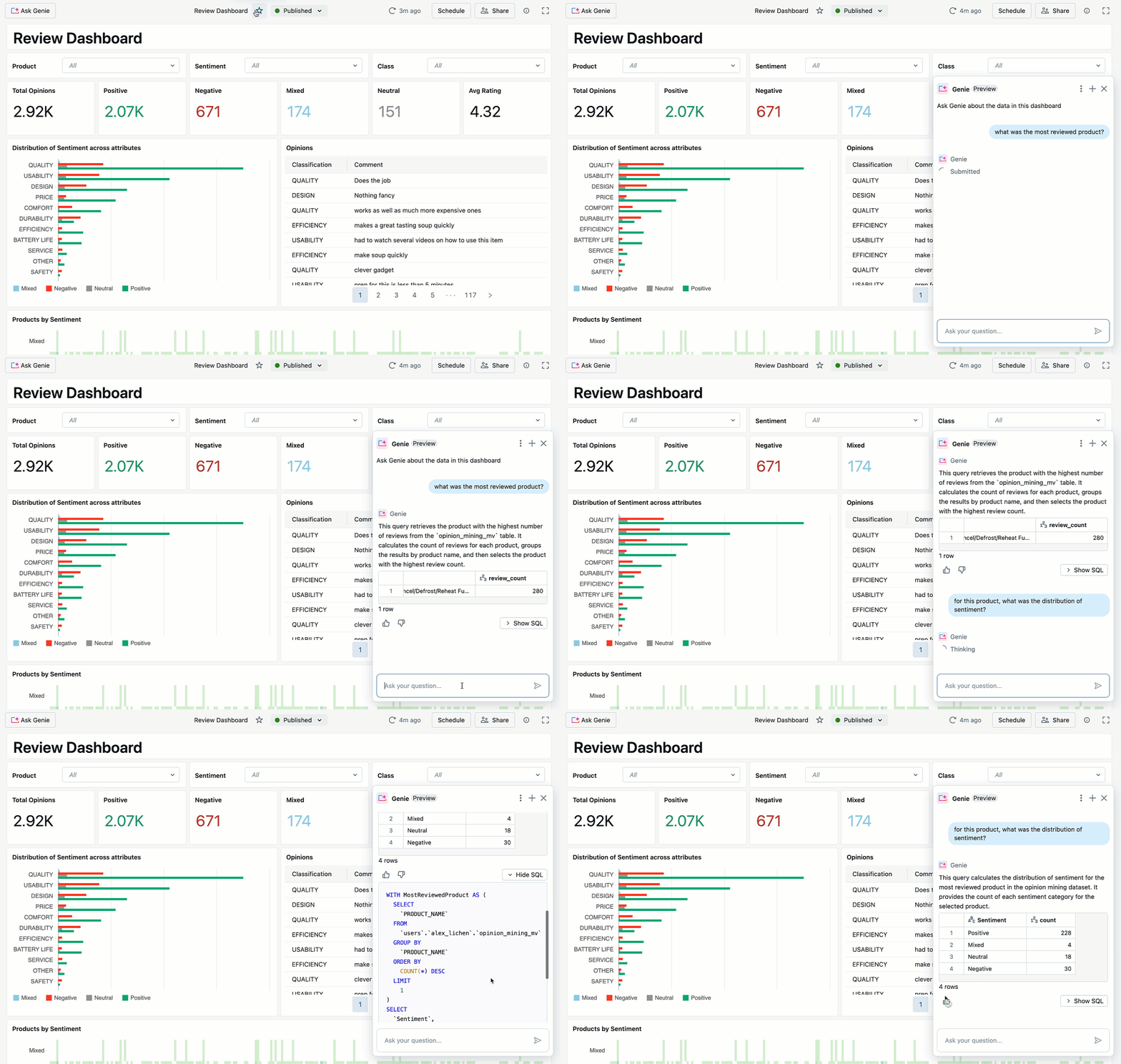
To enable this feature, authors just need to turn on the Genie toggle when publishing a dashboard. Any viewer who has access to the underlying dashboard tables can then ask follow-up questions.
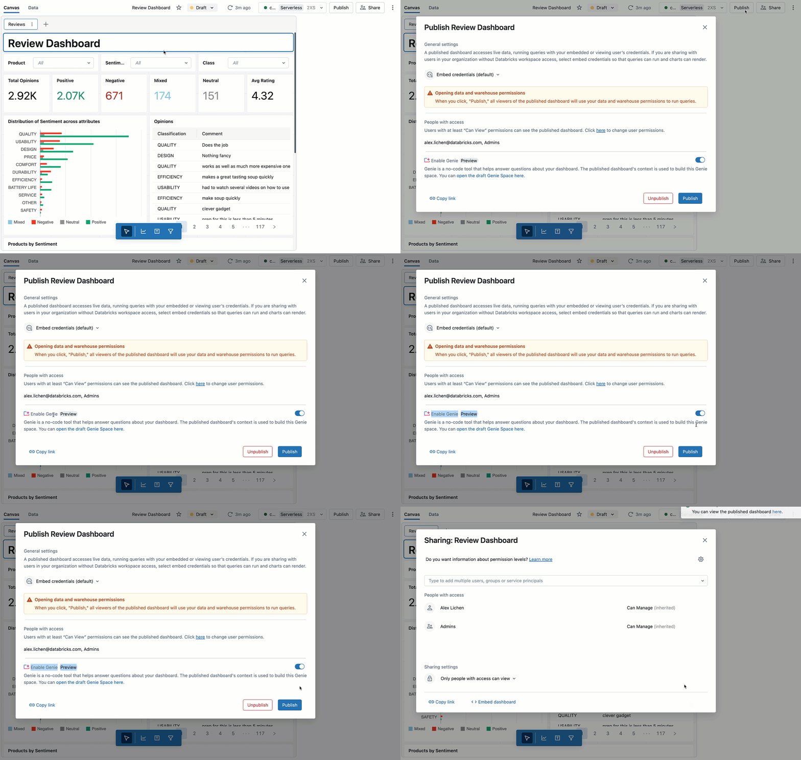
You can also open the linked companion Genie space to see past chats and monitor usage.
If you’re interested in learning more about how Genie democratizes access to Data and AI for everyone in your organization, check out the Genie product documentation.
Point Map Visualization
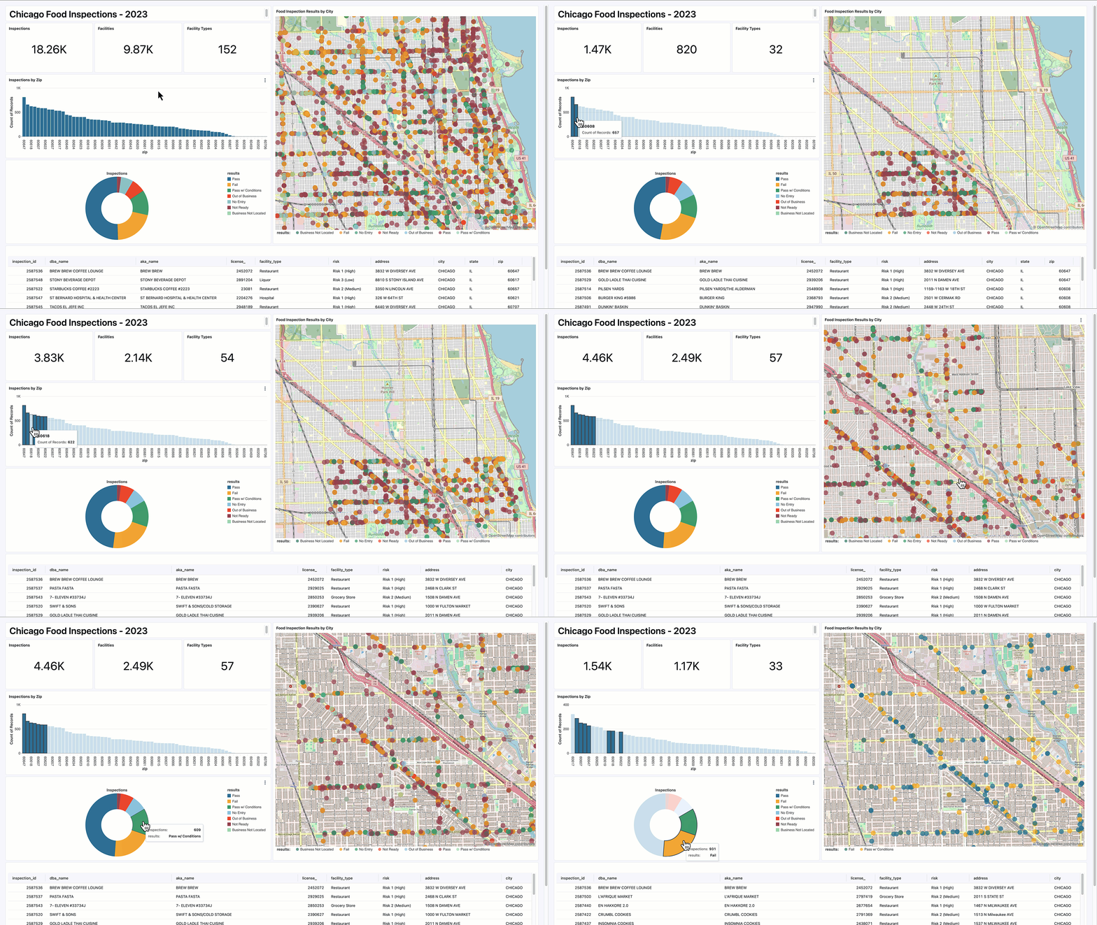
We just added a new Point Map visual type in AI/BI Dashboards, which introduces a new way to get insights from geospatial data. With support for latitude and longitude attributes, this visualization enables users to plot data points on an interactive map, ideal for organizations tracking assets, events, or entities across different locations. Markers can be further segmented by an additional dimension, using colors to distinguish categories.
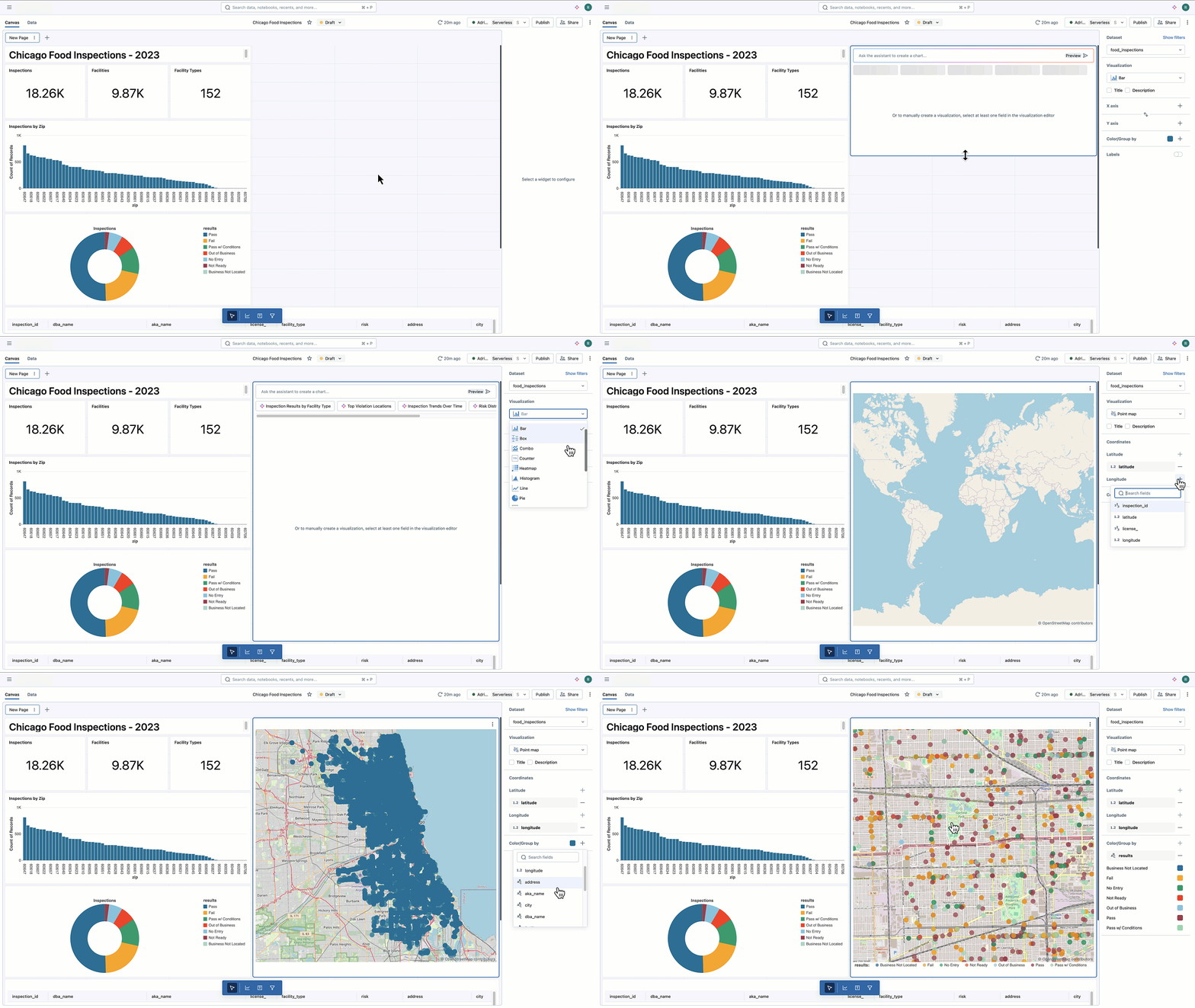
The map visual is easily created using the right-hand configuration panel. Just drag the new visual type onto the canvas and resize it to your liking. Next, pick the latitude and longitude attributes from your dataset, and if desired, choose how to segment the point markers by color.
Once your map is created and configured to your preferences, just publish and share your Dashboard for everyone to use.
Dashboards integration with DABs
As part of the Databricks CLI release v0.232.0 we now include support for managing AI/BI Dashboards with Databricks Asset Bundles (DABs). As recently announced, DABs enable you to easily bundle resources like jobs, pipelines, notebooks, and now AI/BI Dashboards so you can version, test, deploy, and collaborate on your project as a unit. DABs help you adopt software engineering best practices for your data, BI, and AI projects on the Databricks Platform. They also facilitate source control, code review, testing, and continuous integration and delivery (CI/CD) for all your data assets as code.
In this first release of Dashboards and DABs integration you can turn existing Dashboards into a bundle configuration and .lvdash.json files, then deploy them, make visual modifications, and pull those back into your local configuration. Version control and CI/CD workflows on top of this follow the typical DABs patterns.
For more information on AI/BI Dashboards and DABs integration. check out the release notes and product documentation for guidance and examples. We have also created an example bundle configuration on Github using the NYC taxi trip analysis dashboard for you to try out.
Other new features (in case you missed the news)
The updates to AI/BI Dashboards outlined above build on a strong foundation of continuous improvement in the product. In recent months, we’ve introduced a ton of new features that deepen dashboard interactivity, simplify sharing, and expand integration options. In case you missed them, let’s recap:
- Next-Level Interactivity: Enhancements that allow users to engage dynamically with dashboard elements, bringing insights to life through more responsive and interactive visuals, including cross-filtering, static widget parameters, filter default values, query-based parameters and improved dashboard performance to keep things snappy. Read about these new features in this blog.
- Enhanced External Sharing: Sharing dashboards with users outside the Databricks workspace is now simpler than ever, promoting broader access to insights across your organization. Read how you can now share AI/BI Dashboards with everyone in your organization here.
- Embedded AI/BI Dashboards: We also recently announced that you can embed dashboards into third-party applications, so AI/BI can reach users where they work, extending the reach of analytics into their everyday applications and workflows.
Together, these features support a more versatile and collaborative analytics experience, making it much easier for users to access and act on insights when and wherever they need them.
What’s Next for AI/BI Dashboards?
Looking forward, AI/BI Dashboards has a roadmap packed with features designed to advance usability, management, collaboration and depth of analytics. A few of these planned enhancements include:
- Seamless Onboarding and Dashboard sharing on Azure. Databricks users on Azure will soon be able to share AI/BI Dashboards directly with Entra ID users without the need to pre-provision access or edit complex SCIM scripts just to enable dashboard sharing.
- Custom tooltips for adding additional information to visualizations. For instance, on a map, users will be able to add additional metadata to coordinate points such as location name or additional values.
- Custom calculations to create new user-defined metrics and dynamic attributes from data elements that already exist in your source data.
- Git folder integration to enable enhanced version control within AI/BI Dashboards, for improved traceability, lifecycle management, and developer collaboration.
Along with all the new features discussed in this blog, these innovations aim to further accelerate time to insight and improve productivity with data and AI for everyone in your organization.
How to learn more and join the AI/BI journey
For those already using AI/BI, thank you for joining us on this journey to democratize data insights for your knowledge workers. If you’re a Databricks SQL customer who hasn’t yet explored AI/BI, what are you waiting for? To learn more, we invite you to explore our latest product documentation, visit our webpage, watch the demos, and stay tuned as we continue to introduce even more powerful capabilities to Databricks AI/BI.
Source link
lol
