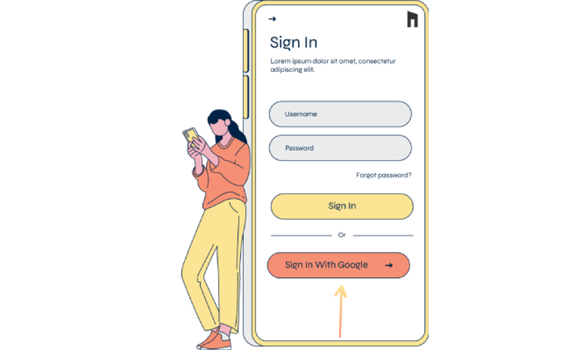
Have you ever been designing a website and been working on a flawless page when all of a sudden the iOS Safari keyboard appears? There it is—a large blank area that is not welcome on your page.
You’re not alone, though, if you’re scratching your head as to why that is.
Let’s investigate this peculiar issue and work out a solution.
What’s Going On?
Imagine this: your user taps on a form field, and the virtual keyboard just magically appears. As it pushes up the content, a little pesky white space shows up at the bottom of the page. It’s like your design suddenly decided that it needed a little extra breathing room.
This is due to the fact that iOS Safari itself handles the change in viewport size when the keyboard comes up, but sometimes it gets a little confused. The browser attempts to resize the content area but then leaves that awkward gap.
Why Is This Happening?
Think of iOS Safari’s handling of the viewport like trying to squeeze into jeans that are just a bit too tight. The browser tries to adjust, but sometimes it doesn’t quite fit right. This results in that awkward white space at the bottom of your page.
How To Fix The White Space Issue
Luckily, some very simple, quite beginner-friendly fixes will help you tackle this. Let’s fix those layout hiccups:
- Add CSS for the Viewport Height
One of the most primitive fixes is to just adjust your CSS in such a way so as to deal with dynamic viewport height. You set up a minimum height on your content, hence even when the keyboard opens, things don’t look very awkward.
html, body {
height: 100%;
margin: 0;
overflow: hidden;
}
.content {
min-height: 100vh; /* Ensures the content area is at least as tall as the viewport */
display: flex;
flex-direction: column;
}
It’s like giving your content a “height boost.” Everybody needs a little more height sometimes, right?
2. Use JavaScript to Adjust the Page Height
Well, if you’re a little more adventurous and really want to get down to business, you can dynamically adjust the height of the page using JavaScript. You could say it’s like having your own personal assistant on your website, making sure it’s always at the perfect height.
function adjustHeight() {
document.body.style.height = `${window.innerHeight}px`;
}
window.addEventListener('resize', adjustHeight);
adjustHeight(); // Call it on page load
Think of it as making sure your webpage never has to slouch.
3. Check for Fixed Position Elements
Fixed-position elements can sometimes be part of a layout that is messing up when the keyboard is up. Make sure those aren’t the issue. Either change their position or fix them using media queries for different screen sizes and orientations.
.header, .footer {
position: fixed;
width: 100%;
}
Imagine these elements like VIP guests at a party: give them their own space, but not at the expense of dominating the entire room!
4. Test on Multiple Devices
You should also test your fixes on many iOS devices. What works on one iPhone might not work on another. Just like shoes, you need to see that everything fits just right.
Testing issues will be best caught with real devices and not on emulators only. You wouldn’t buy a pair of shoes without trying them on, right?.
Conclusion
The whitespace problem in iOS Safari when the keyboard is opened—consider it something of a tiny design enigma. Still, these fixes will make it disappear and keep your page sharp. Think of it as a chance to flex those web development guns and maybe have a couple of chuckles along the way.
Source link
lol

