25
Oct
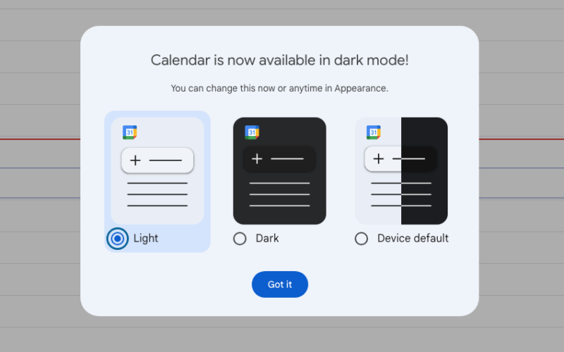
Google Calendar’s web client just got a , all of which should bring the app more in line with There are updated buttons, dialogs and sidebars to make the whole thing “more modern and accessible.”The interface typography got a custom-designed refresh that adds “highly-legible typefaces” to ensure a “fresh feel” while remaining “legible and crisp.” Google Calendar now also lets users toggle between light mode and dark mode, to help reduce both battery usage and eye strain. GoogleThese updates apply to the “entire calendar web experience.” This includes the task list view, which is nice. However, Google has warned that…

