We’ve been working on these improvements for quite some time, so it’s exciting to share them with the world finally!
Here’s what’s included in the latest release of Neptune.
Redesigned navigation: More space for what matters most
Starting from the top, let’s talk about the redesigned navigation. Your Neptune app’s working space is where you display a lot of stuff—like, really, a lot. We’ve seen setups that couldn’t fit into two huge monitors. It houses everything from the runs table, filled with hundreds of rows of experiments, to diverse visualizations, charts, and any other metadata one could think of. You don’t want to be distracted by anything else.
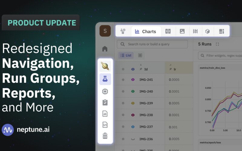
So we brainstormed how to give more of this working space to you instead of throwing navigational elements in there. Here’s the result:
- The huge left sidebar is gone. No more hiding and unhiding it. Instead, we created a very narrow, noninvasive sidebar with all the key actions at hand.
- Projects are now pinned in this sidebar, which streamlines the back-and-forth between individual projects and the All Projects tab.
- We have consolidated the separate runs table, run details, and compare runs views into one single view, freeing up a ton of space at the top of your screen.
You now have more room for what matters most.
Run groups: Level up the analysis of your experiments
To some extent, grouping experiments has always been possible in Neptune. But we’re now elevating run groups to be more important citizens of Neptune. We’ve made a lot of enhancements to make this functionality way more advanced and user-friendly.
Here’s what’s new:
- Most importantly, you can now group experiments by string sets, e.g., tags and newly introduced group tags.
- A toggle located on the left-hand side, just above the table, allows you to switch between list and group views. The group view automatically organizes experiments based on the group tag.
- A single run can be associated with multiple groups, reflecting its relevance across various contexts.
- Managing group tags is very straightforward. You can add or adjust them through UI or programmatically.
- When analyzing groups on charts, you can click the Match runs toggle to unify the line color of all runs within the group.
Hopefully, run groups will help you organize and compare experiments quicker, especially in large-scale projects.

Reports: One more way to preserve the context
We’re excited to introduce the capability many users have been asking for: Reports.
You can think of them as an enhancement to the existing dashboards. A report allows you to not only choose widgets for your analysis but also to select a persistent group of runs that remain visible each time you access a report. You can come back to a report anytime, and the experiments you want to look at are already there.
Alongside custom table views, Reports offer another option for saving specific context you want to analyze or share with your colleagues.
Note that this is just the initial release of Reports. We’re already working on further enhancements to the reporting capability, including the ability to add more widgets and text to the report. Soon, you’ll be able to fully document the progress and results of your projects.

Improvements in runs table, charts, and legends: Small things that make the difference
Finally, you know how they say the devil lies in the details, right? So, apart from those bigger themes, there are a bunch of minor improvements that we don’t want you to miss.
A few changes in the runs table include:
- We’re working on bringing the run name to the front row of the runs table. It is now one of the default columns and will become the primary column in the next update.
- There are a few changes in search functionality. The search in the runs table now targets the Run Name by default, with an option to switch to query builder mode for complex searches.
- We enabled the search history in the runs table.
- The runs table “Add Column” search now supports an unlimited number of unique attribute names.
- Finally, we redesigned the eye icon, which indicates a run selected for comparison. The new design brings a lot more clarity to what has been selected.
Moving on to charts, here’s what’s new:
- Hovering over a run in the table now highlights its corresponding line in the chart.
- You can now change the color assigned to a run, and the choice will remain persistent.
- We also enabled search history in the charts section.
- The chart legends also have a few improvements. For one, they are displayed even if you select more than 15 runs for comparison.
- You can add data points to chart legends directly in the legend toolbar.
- We also added a separate area for legend in the full-screen comparison chart mode.

And finally, two enhancements in the dashboards:
- You can now preview what a chart would look like once you’re creating the widget.
- Any adjustments you make in dashboards are autosaved.
All these changes bring the user experience to the next level. And be sure we’re not stopping here. More improvements are on the way.
I hope you find value in the newly introduced features. If you need more information about particular features, refer to the documentation.
Also, log into your Neptune account and just test the changes!
And if you want to share any feedback with us, reach out via in-app chat. We’d love to hear from you!
Explore more content topics:
Source link
lol

