Step into Ancient Rome with a Modern Twist
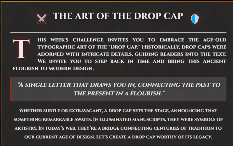
Inspired by the grandeur of ancient Rome, this gladiator-themed drop cap design elevates the classic typographic style with bold animations, rich color gradients, and immersive textures. Perfect for storytelling and history-themed sites, this drop cap brings dramatic flair and visual depth to any content with a single bold letter.
In this guide, we’ll dive into the key components, animations, and interactive effects that make this design stand out, and how each element contributes to an engaging user experience. You can explore this example directly on CodePen, and see it come to life in real-time: Check it out here!
Key Features and Design Choices
Rich Visual Background with Overlay
The background overlay features a subtle texture that hints at an ancient, gladiator-style setting. This texture, combined with a blur and brightness animation, gives the background a “breathing” effect, enhancing the depth and ambiance of the design.
The Drop Cap: Bringing Drama to the First Letter
The animated drop cap “T” immediately draws attention, set apart by its large size, gradient colors, and a shadow effect.
A slight hover interaction transforms the letter with scale and rotation, adding a hint of dynamism and inviting users to engage with the design.
Upon clicking, users experience a ripple effect emanating from the drop cap, adding another layer of interaction that feels both playful and immersive.
Elegant Typography and Iconography
The Cinzel font, inspired by ancient Roman inscriptions, creates a sense of historical authenticity and grandeur.
The header decoration includes a sword and shield icon, further reinforcing the gladiator theme and adding visual intrigue.
The footer decoration with laurel icons provides a cohesive look and emphasizes the theme of ancient Roman valor.
Implementation Details
CSS Variables for Easy Theme Customization
Using CSS variables, the project maintains a consistent theme with easy customization options:
:root {
  --primary-color: linear-gradient(145deg, #d4af37, #e6b958); /* Gold gradient */
  --accent-color: #b71c1c; /* Deep red for drama */
  --bg-gradient: radial-gradient(circle, #2a1212, #1a1a1a);
  --text-color: #f4f4f4;
  --font-cinzel: 'Cinzel', serif;
  --transition-speed: 0.6s;
}
Background Overlay with Subtle Animation
The background overlay uses a radial gradient and a blurred texture to create a rich and layered look. An alternating animation, backgroundGlow, subtly changes brightness and blur to keep the background visually engaging without distracting from the main content.
.background-overlay {
  background: url('https://i.ibb.co/TMPQ6Yp/ancient-pattern.jpg') no-repeat center;
  background-size: cover;
  opacity: 0.25;
  filter: blur(7px) brightness(0.5);
  animation: backgroundGlow 5s infinite alternate ease-in-out;
}
Drop Cap Animation and Hover Effects
The drop cap takes center stage with a scaling and rotation effect that activates on hover. This effect uses a transition to give a smooth experience that feels natural and responsive.
.drop-cap:hover {
  color: var(--accent-color);
  transform: scale(1.2) rotate(-5deg);
  text-shadow: 0px 10px 25px rgba(183, 28, 28, 0.7), 0 0 35px var(--primary-color);
}
Interactive JavaScript Effects
A simple JavaScript script adds interactive effects that enhance user engagement:
Glow Effect on Hover
On hovering, the drop cap’s shadow intensifies and rotates slightly, inviting users to explore the interaction.
Ripple Effect on Click
When users click the drop cap, a ripple effect spreads from the center, simulating the impact of a dropped stone in water—a simple yet effective way to add visual feedback.
dropCap.addEventListener("click", () => {
const ripple = document.createElement("span");
ripple.classList.add("ripple-effect");
ripple.style.position = "absolute";
ripple.style.left = "50%";
ripple.style.top = "50%";
ripple.style.transform = "translate(-50%, -50%) scale(0)";
ripple.style.width = "120%";
ripple.style.height = "120%";
ripple.style.borderRadius = "50%";
ripple.style.backgroundColor = "rgba(255, 215, 0, 0.4)";
ripple.style.animation = "ripple 0.6s ease-out";
dropCap.appendChild(ripple);
ripple.addEventListener("animationend", () => ripple.remove());
});
Final Thoughts
This gladiator-inspired drop cap demonstrates how simple elements—combined with thoughtful CSS and JavaScript animations—can create a lasting visual impact. Ideal for storytelling, this component draws users in and sets a captivating tone.
Explore More
Visit the full design on CodePen: View on CodePen
Stay updated with the latest from Gladiators Battle:
Visit our site for more design inspiration and gameplay: https://gladiatorsbattle.com/
Follow us on Twitter for news and exclusive updates: https://x.com/GladiatorsBT
Whether you’re looking to add a dramatic flourish to your own designs or just curious about integrating historical aesthetics with modern web styling, this guide will provide both inspiration and practical steps to elevate your next project.
Source link
lol

