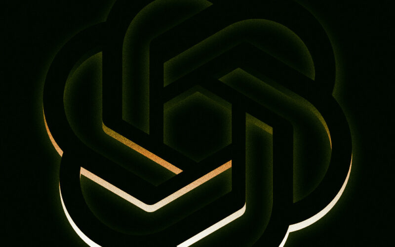
This is so dumb.
O My
You’ve probably noticed how a lot of companies these days are stripping down their logos in favor of something more “minimalist.” ChatGPT maker OpenAI is apparently about to head down the same path — much to the chagrin of some of the people working there.
As Fortune reports, OpenAI unveiled its ongoing redesign efforts at a recent company-wide meeting, according to the magazine’s sources. That included new typefaces, but most of all, a new logo: a large — and not particularly distinct — black “O.” (No pictures available yet, but it’s not hard to imagine.)
This change wasn’t received well by many of the company’s staff, some of whom were vocal about their distaste. Beyond seeming creatively bankrupt, some found the new logo to be outright “ominous.” Maybe it’s the gaping void evinced by the ring now occupying where the company’s iconic geometric flower should be. Just a guess.
While it’s still just a proposed logo at this point, the fact that OpenAI is serious about potentially using it is a case in point of the company’s foundering efforts to consolidate its brand as its product names continue to fall flat.
Brand Spanking New
As Fortune notes, the new logo is a dramatic departure from OpenAI’s iconic floral symbol, which is meant to evoke “precision, potential and optimism.” It’s hard to imagine any of those being embodied in the new one.
In fact, OpenAI’s whole proposed redesign borders on self-parody — as if it saw Microsoft and Google flattening their logos and decided to take the trend towards minimalism to its extreme. Except OpenAI’s logo is already pretty minimal to begin with. And now it wants to take that and turn it into literally just a circle? Huh?
This is the kind of aesthetic virtuosity produced by around a year of redesign work, according to Fortune, coinciding with when OpenAI brought on new creative hires. Sounds like they’ve been busy.
To be fair, part of the motivation behind the brand shift is that the company doesn’t actually own some of the typefaces it uses. That excuse, though, doesn’t apply to the floral logo itself, which was designed in-house. So, back to the same question: why?
Face-Off
There’s not a lot of companies that can claim to have become the face of a new paradigm in technology and culture in just a matter of years.
Think of how quickly the public has gone from not even knowing what the terms “generative AI” or “large language model” meant, to them becoming tangible products that hundreds of millions of people now use and argue about at dinner.
And largely, OpenAI is the name that people associate with this new age of AI, with its logo being its “most recognizable brand element,” as the company once said of itself, per Fortune.
We’re sure the company has its reasons for risking some of that brand recognition, but it really sounds like it’s just shooting itself in the foot.
More on OpenAI: OpenAI Says It’s Fixed Issue Where ChatGPT Appeared to Be Messaging Users Unprompted
Source link
lol

