Welcome back to your CSS adventure! Today, we’re diving into one of the most powerful tools in your web design arsenal: CSS Grid Layout. Think of it as the Swiss Army knife of layout techniques – versatile, precise, and capable of transforming your web pages into beautifully organized masterpieces. Ready to grid and bear it? Let’s go!
What is CSS Grid Layout?
Imagine you’re playing a game of Tetris, but instead of stacking random blocks, you get to decide where everything goes. That’s basically what CSS Grid does! It allows you to create complex, grid-based layouts that are both flexible and easy to manage. Whether you’re working on a basic two-column layout or a full-blown magazine-style page, CSS Grid has got your back.
Why Use CSS Grid?
Before Grid, web developers had to rely on clunky methods like floats, tables, or even nested divs to create layouts. It was like trying to build a Lego castle with only square blocks. But with CSS Grid, you get all the pieces you need to create something truly spectacular. Here’s why you’ll love it:
- Flexibility: Create any layout you can dream of, from simple to complex.
- Precision: Control over spacing, alignment, and order with minimal effort.
- Simplicity: Clean, readable code that’s easy to maintain and modify.
Setting Up Your Grid: The Basics
Let’s start with the basics. To create a grid, you need a grid container and some grid items. The container is where the magic happens, and the items are the elements that get placed on the grid.
<div class="grid-container">
    <div class="grid-item">1</div>
    <div class="grid-item">2</div>
    <div class="grid-item">3</div>
    <div class="grid-item">4</div>
</div>
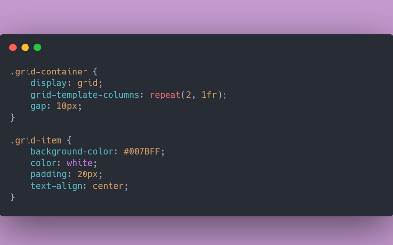
Now, let’s turn that container into a grid in your CSS:
.grid-container {
    display: grid;
    grid-template-columns: repeat(2, 1fr);
    gap: 10px;
}

.grid-item {
    background-color: #007BFF;
    color: white;
    padding: 20px;
    text-align: center;
}
Understanding the Grid Properties
Let’s break it down:
-
display: grid: This turns your container into a grid. -
grid-template-columns: repeat(2, 1fr): This creates two equal-width columns.1fris a flexible unit that takes up one part of the available space. -
gap: 10px: This adds a 10px gap between your grid items.
Placing Items on the Grid: You’re the Boss
Now that we have our grid, let’s get fancy with how we place items. With CSS Grid, you can specify exactly where you want each item to go, like a master strategist planning the ultimate game board.
.grid-container {
    display: grid;
    grid-template-columns: 1fr 2fr;
    grid-template-rows: auto;
    gap: 10px;
}

.grid-item:first-child {
    grid-column: 1 / 3;
}
In this example, the first grid item spans across two columns, while the rest stay neatly in their lanes. You can place items anywhere in the grid by defining their start and end points with grid-column and grid-row. It’s like being able to park your car diagonally in a parking lot – because you can!
Advanced Grid Techniques: Unleash Your Inner Architect
Ready to take things up a notch? CSS Grid isn’t just about placing items in boxes; it’s about creating entire layouts with precision and ease.
1. Nested Grids
Think of it as grids within grids – an inception of layout possibilities.
.grid-container {
    display: grid;
    grid-template-columns: 1fr 2fr;
    gap: 20px;
}

.nested-grid {
    display: grid;
    grid-template-columns: repeat(2, 1fr);
    gap: 10px;
}
Here, .nested-grid is a grid item inside the main grid but also a grid container itself, allowing you to create even more complex layouts.
2. Auto-Fill and Auto-Fit
Want your grid to adapt based on the available space? Meet auto-fill and auto-fit.
.grid-container {
    display: grid;
    grid-template-columns: repeat(auto-fill, minmax(150px, 1fr));
    gap: 10px;
}
This setup automatically creates as many columns as possible that are at least 150px wide. Perfect for responsive designs where you want your content to adjust gracefully, like a cat always landing on its feet.
Wrapping Up
CSS Grid is the ultimate tool for creating layouts that are both powerful and flexible. It might seem a bit daunting at first, but once you get the hang of it, you’ll wonder how you ever lived without it. With Grid, you’re not just building a webpage; you’re crafting a visually stunning, well-organized masterpiece.
Happy coding!
Source link
lol

